Last week I talked about objects including scalars, vectors, matrices, dataframes, and lists. This post will show you how to use the objects (and their corresponding classes) you create in R to your advantage.
First off, it's important to remember that columns of dataframes are vectors. That is, if I have a dataframe called mydata, the columns mydata$Height and mydata$Weight are vectors. Numeric vectors can be multiplied or added together, squared, added or multiplied by a constant, etc. Operations on vectors are done element by element, meaning here row by row.
First, I read in a file of data, called mydata, using the read.csv() function. I get the dataframe below:

I check the classes of my objects using class(), or all at the same time with ls.str().
class(mydata$Weight)
class(mydata$Height)
or

So I see that mydata is a dataframe and all my columns are numeric (num). Now, if I want to create a new column in my dataset which calculates BMI, I can do some vector operations:
mydata$BMI<-mydata$Weight/(mydata$Height)^2 * 703

Which is the formula for BMI from weight in pounds and height in inches. Notice how if any component of the calculation is a missing (NA) value, R calculates the BMI as NA as well.
Now I can do summary statistics on my data and store those as a matrix. For example, I start with summary statistics on my Age vector:
summary(mydata$Age)
If I want to extract an element of this summary table, say the minimum, I can do
summary(mydata$Age)[1]
which extracts the first element (of 6) of the summary table.
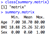
But what I really want is a summary matrix of a bunch of variables: Age, Sex, and BMI. To do this I can rowbind the summary statistics of those three variables together using the rbind() function, but only take the 1st, 4th, and 6th elements of the summary table, which as you can see correspond to the Min, Mean, and Max. This creates a matrix, which I call summary.matrix:
summary.matrix<-rbind(summary(mydata$Age)[c(1,4,6)], summary(mydata$BMI)[c(1,4,6)], summary(mydata$Sex)[c(1,4,6)])
Rowbinding is basically stacking rows on top of each other. I add rownames and then print the class of my summary matrix and the results.
rownames(summary.matrix)<-c("Age", "BMI", "Sex")
class(summary.matrix)
summary.matrix
There is also a much more efficient way of doing this using the apply() function. Previously I had another post on the apply function, but I find that it takes a lot of examples to get comfortable with so here is another application.
Apply() is a great example of classes because it takes in a dataframe as the first argument (mydata, all rows, but I choose only columns 2, 3, and 7). I then apply it to the numeric vector columns (MARGIN=2) of this subsetted dataframe, and then for each of those columns I perform the mean and standard deviation, removing the NA's from consideration. I save this in a matrix I call summary.matrix2.
summary.matrix2<-apply(mydata[,c(2,3,7)], MARGIN=2, FUN=function(x) c(mean(x,na.rm=TRUE), sd(x, na.rm=TRUE)))
I then rename the rows of the this matrix and print the results, rounded to two decimal places. Notice how the format of the final matrix is different here. Above the rows were the variables and the columns the summary statistics, while here it is reversed. I could have column binded (cbind() instead of the rbind()) in the first case and I would have gotten the matrix transposed to be like this one.
rownames(summary.matrix2)<-c("Mean", "Stdev")
round(summary.matrix2, 2)

Finally, I want to demonstrate how you can take advantage of scalars and vectors when graphing. Creating scalar and vectors objects is really helpful when you are doing the same task multiple times. I give the example of creating a bunch of scatterplots.
I want to make a scatterplot for each of three variables (Height, Weight, and BMI) against age. Since all three scatterplots are going to be very similar, I want to standardize all of my plotting arguments including the range of ages, the plot symbols and the plot colors. I want to include a vertical line for the mean age and a title for each plot. The code is below:
##Assign numeric vector for the range of x-axis
agelimit<-c(20,80)
##Assign numeric single scalar to plotsymbols and meanage
plotsymbols<-2
meanage<-mean(mydata$Age)
##Assign single character words to plottype and plotcolor
plottype<-"p"
plotcolor<-"darkgreen"
##Assign a vector of characters to titletext
titletext<-c("Scatterplot", "vs Age")
Ok, so now that I have all those assigned, I can plot the three plots all together using the following code. Notice how all the highlighted code is the same in each plot (except for the main title) and I'm using the assigned objects I just created. The great part about this is that if I decide I actually want to plot color to be red, I can change it in just one place. You can think about how this would be useful in other situations (data cleaning, regressions, etc) when you do the same thing multiple times and then decide to change one little parameter. If you're not sure about the code below, I posted on the basics of plotting here.
##Plot area is 1 row, 3 columns
par(mfrow=c(1,3))
##Plot all three plots using the assigned objects
plot(mydata$Age, mydata$Height, xlab="Age", ylab="Height", xlim=agelimit,pch=plotsymbols, type=plottype, col=plotcolor, main=paste(titletext[1], "Height", titletext[2]))
abline(v=meanage)
plot(mydata$Age, mydata$Weight, xlab="Age", ylab="Weight", xlim=agelimit,pch=plotsymbols, type=plottype, col=plotcolor, main=paste(titletext[1], "Weight", titletext[2]))
abline(v=meanage)
plot(mydata$Age, mydata$BMI, xlab="Age", ylab="BMI", xlim=agelimit,pch=plotsymbols, type=plottype, col=plotcolor, main=paste(titletext[1], "BMI", titletext[2]))
abline(v=meanage)
Notice how I do the main title with the paste statement. Paste() is useful for combining words and elements of another variable together into one phrase. The output looks like this, below. Pretty nice!

I just wanted to add a comment here to mention thanks for you very nice ideas. Blogs are troublesome to run and time consuming thus I appreciate when I see well written material. Your time isn’t going to waste with your posts.
ReplyDeleteback muscle pain
Thanks! I'm glad you find it useful. It is motivating for me to keep posting when I know it is helpful to people. :)
ReplyDeleteNice, quick summary of making and naming plots. Very interesting point about saving the names as local variables/objects - I don't do that but this post might provide the impetus for me to.
ReplyDeleteGlad you like it! Thanks for the comment!
Delete