Showing posts with label normal. Show all posts

Monday, February 25, 2013

Normal distribution functions

Ah, the Central Limit Theorem.  The basis of much of statistical inference and how we get those 95% confidence intervals.  It's just so beautiful!  Lately, I have found myself looking up the normal distribution functions in R.  They can be difficult to keep straight, so this post will give a succinct overview and show you how they can be useful in your data analysis.

To start, here is a table with all four normal distribution functions and their purpose, syntax, and an example:

Purpose Syntax Example
rnorm Generates random numbers 
from normal distribution
rnorm(n, mean, sd) rnorm(1000, 3, .25)
Generates 1000 numbers
from a normal with mean 3
and sd=.25
dnorm Probability Density Function
(PDF)
dnorm(x, mean, sd) dnorm(0, 0, .5)
Gives the density (height of the
PDF) of the normal
with mean=0 and sd=.5. 
pnorm Cumulative Distribution Function
(CDF)
pnorm(q, mean, sd) pnorm(1.96, 0, 1)
Gives the area under the
standard normal curve to
the left of 1.96,
i.e. ~0.975
qnorm Quantile Function - inverse of
pnorm
qnorm(p, mean, sd) qnorm(0.975, 0, 1)
Gives the value at which the
CDF of the standard normal
is .975, i.e. ~1.96

Note that for all functions, leaving out the mean and standard deviation would result in default values of mean=0 and sd=1, a standard normal distribution.

Another important note for the pnorn() function is the ability to get the right hand probability using the lower.tail=FALSE option.  For example,


In the first line, we are calculating the area to the left of 1.96, while in the second line we are calculating the area to the right of 1.96.

With these functions, I can do some fun plotting. I create a sequence of values from -4 to 4, and then calculate both the standard normal PDF and the CDF of each of those values.  I also generate 1000 random draws from the standard normal distribution. I then plot these next to each other. Whenever you use probability functions, you should, as a habit, remember to set the seed. Setting the seed means locking in the sequence of "random" (they are pseudorandom) numbers that R gives you, so you can reproduce your work later on.

set.seed(3000)
xseq<-seq(-4,4,.01)
densities<-dnorm(xseq, 0,1)
cumulative<-pnorm(xseq, 0, 1)
randomdeviates<-rnorm(1000,0,1)
 
par(mfrow=c(1,3), mar=c(3,4,4,2))

plot(xseq, densities, col="darkgreen",xlab="", ylab="Density", type="l",lwd=2, cex=2, main="PDF of Standard Normal", cex.axis=.8)

plot(xseq, cumulative, col="darkorange", xlab="", ylab="Cumulative Probability",type="l",lwd=2, cex=2, main="CDF of Standard Normal", cex.axis=.8)

hist(randomdeviates, main="Random draws from Std Normal", cex.axis=.8, xlim=c(-4,4))

The par() parameters set up a plotting area of 1 row and 3 columns (mfrow), and move the three plots closer to each other (mar). Here is a good explanation of the plotting area.  The output is below:


Now, when we have our actual data, we can do a visual check of the normality of our outcome variable, which, if we assume a linear relationship with normally distributed errors, should also be normal. Let's make up some data, where I add noise by using rnorm() - here I'm generating the same amount of random numbers as is the length of the xseq vector, with a mean of 0 and a standard deviation of 5.5.

xseq<-seq(-4,4,.01)
y<-2*xseq + rnorm(length(xseq),0,5.5)

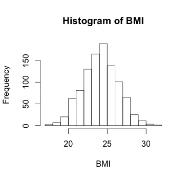
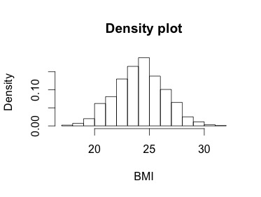
And now I can plot a histogram of y (check out my post on histograms if you want more detail) and add a curve() function to the plot using the mean and standard deviation of y as the parameters:

hist(y, prob=TRUE, ylim=c(0,.06), breaks=20)
curve(dnorm(x, mean(y), sd(y)), add=TRUE, col="darkblue", lwd=2)

Here, the curve() function takes as its first parameter a function itself (or an expression) that must be written as some function of x.  Our function here is dnorm(). The x in the dnorm() function is not an object we have created; rather, it's indicating that there's a variable that is being evaluated, and the evaluation is the normal density at the mean of y and standard deviation of y. Make sure to include add=TRUE so that the curve is plotted on the same plot as the histogram.  Here is what we get:


Here are some other good sources on the topic of probability distribution functions:

Saturday, December 22, 2012

Basics of Histograms


Histograms are used very often in public health to show the distributions of your independent and dependent variables.  Although the basic command for histograms (hist()) in R is simple, getting your histogram to look exactly like you want takes getting to know a few options of the plot.  Here I present ways to customize your histogram for your needs.

First, I want to point out that ggplot2 is a package in R that does some amazing graphics, including histograms.  I will do a post on ggplot2 in the coming year.   However, the hist() function in base R is really easy and fast, and does the job for most of your histogram-ing needs. However, if you want to do complicated histograms, I would recommend reading up on ggplot2.

Okay so for our purposes today, instead of importing data, I'll create some normally distributed data myself. In R, you can generate normal data this way using the rnorm() function:

BMI<-rnorm(n=1000, m=24.2, sd=2.2) 

So now we have some BMI data, and the basic histogram plot that comes out of R looks like this:

hist(BMI)


Which is actually pretty nice.  There are a number of things that R does by default in creating this histogram, and I think it's useful to print out that information to understand the parameters of this histogram.  You can do this by saving the histogram as an object and then printing it like this:

histinfo<-hist(BMI)
histinfo

And you get the output below:


This is helpful because you can see how R has decided to break up your data by default. It shows the breaks, which are the cutoff points for the bins. It shows the counts, intensity/density for each bin (same thing but two different names for R version compatibility), the midpoints of each bin, and then the name of the variable, whether the bins are equidistant, and the class of the object. You can of course take any one of these outputs by itself, i.e.  histinfo$counts would give you just the vector of counts.

Now we can manipulate this information to customize our plot.

1. Number of bins

R chooses how to bin your data for you by default using an algorithm, but if you want coarser or finer groups, there are a number of ways to do this. We can see that right now from the output above that the breaks go from 17 to 32 by 1.  You can use the breaks() option to change this in a number of ways.  An easy way is just to give it one number that gives the number of cells for the histogram:


hist(BMI, breaks=20, main="Breaks=20")
hist(BMI, breaks=5, main="Breaks=5")


The bins don't correspond to exactly the number you put in, because of the way R runs its algorithm to break up the data but it gives you generally what you want. If you want more control over exactly the breakpoints between bins, you can be more precise with the breaks() option and give it a vector of breakpoints, like this:

hist(BMI, breaks=c(17,20,23,26,29,32), main="Breaks is vector of breakpoints")


This dictates exactly the start and end point of each bin.  Of course, you could give the breaks vector as a sequence like this to cut down on the messiness of the code:

hist(BMI, breaks=seq(17,32,by=3), main="Breaks is vector of breakpoints")

Note that when giving breakpoints, the default for R is that the histogram cells are right-closed (left open) intervals of the form (a,b]. You can change this with the right=FALSE option, which would change the intervals to be of the form [a,b).  This is important if you have a lot of points exactly at the breakpoint.


2. Frequency vs Density 

Often, we are more interested in density than frequency, since frequency is relative to your sample size. Instead of counting the number of datapoints per bin, R can give the probability densities using the freq=FALSE option:


hist(BMI, freq=FALSE, main="Density plot")


Notice the y-axis now.  If the breaks are equidistant, with difference between breaks=1, then the height of each rectangle is proportional to the number of points falling into the cell, and thus the sum of the probability densities adds up to 1.  Here I specify plot=FALSE because I just want the histogram output, not the plot, and show how the sum of all of the densities is 1:


However, if you choose to make bins that are not all separated by 1 (like breaks=c(17,25,26, 32) or something like that), then the plot still has an area of 1, but the area of the rectangles is the fraction of data points falling into the cells. The densities are calculated like this as counts/(n*diff(breaks).  Thus, this adds up to 1 if add up the areas of the rectangles, i.e. you multiply each density by the difference in the breaks like this:


3. Plot aesthetics 

Finally, we can make the histogram better looking by adjusting the x-axis, y-axis, axis labels, title, and color like this:


hist(BMI, freq=FALSE, xlab="Body Mass Index", main="Distribution of Body Mass Index", col="lightgreen", xlim=c(15,35),  ylim=c(0, .20))

Here along with our frequency option, I changed the x-axis label, changed the main title, made the color light green, and provided limits for both the x-axis and y-axis.  Note that defining the look of you axis using xlim() will not have any impact on the bins - this option is only for the aesthetics of the plot itself.

Finally, I can add a nice normal distribution curve to this plot using the curve() function, in which I specify a normal density function with mean and standard deviation that is equal to the mean and standard deviation of my data, and I add this to my previous plot with a dark blue color and a line width of 2. You can play around with these options to get the kind of line you want:

curve(dnorm(x, mean=mean(BMI), sd=sd(BMI)), add=TRUE, col="darkblue", lwd=2) 


And we get this!